
Candyman Title Sequence Redesign
For my Title Design class, I chose to remake the title sequence for the 1992 horror classic "Candyman". Using the original score, credits, and title conventions, I undertook a 10- week-long process to totally redesign the visual style.
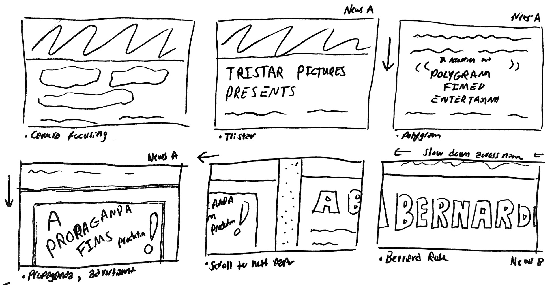
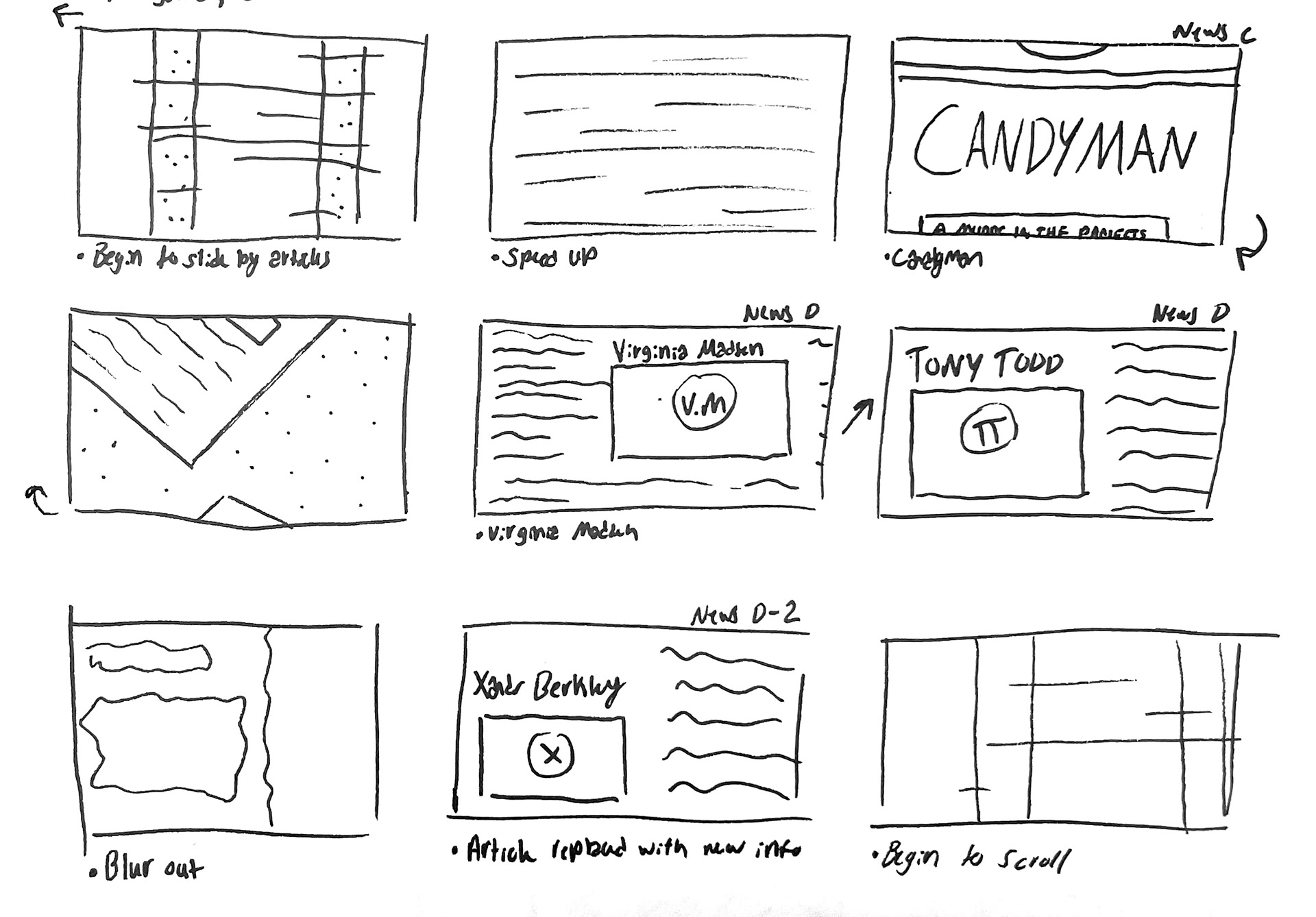
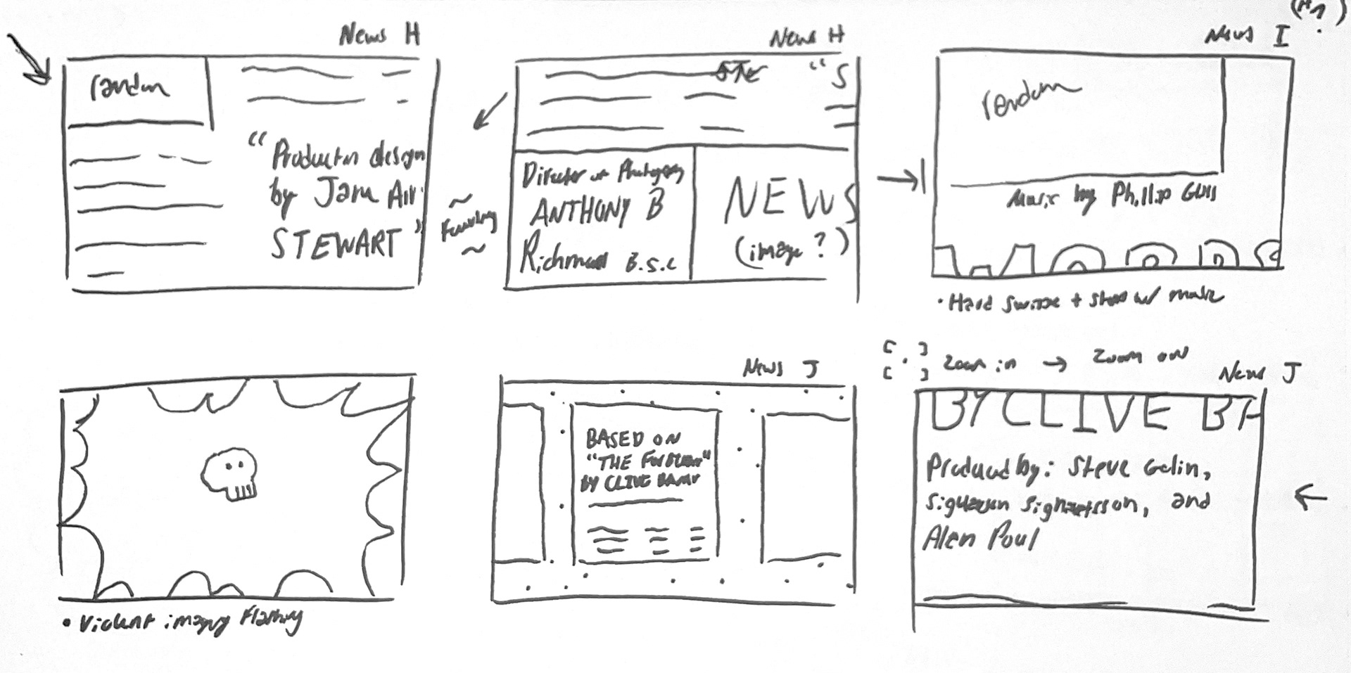
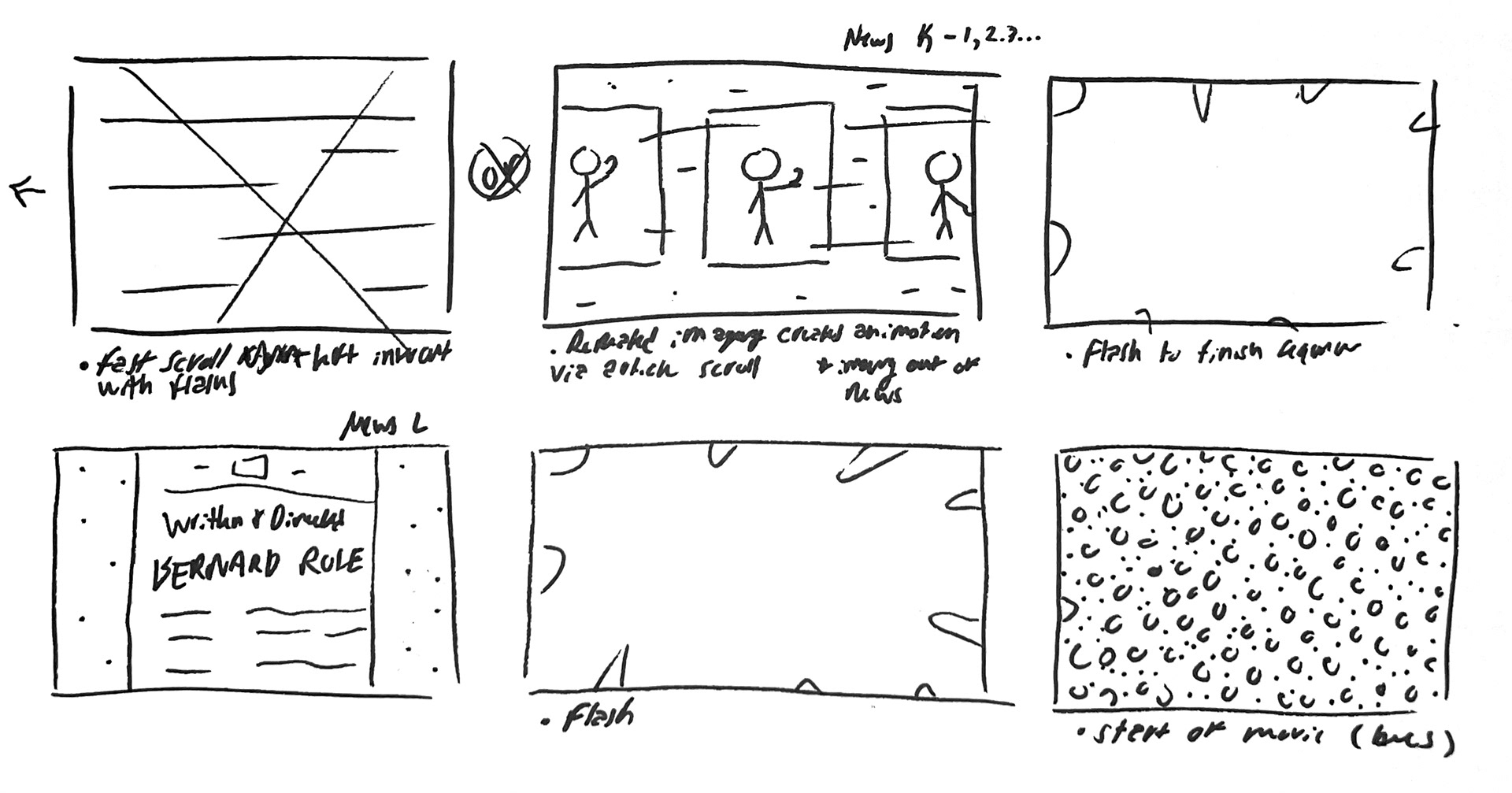
Storyboard


Initial Design Concepts
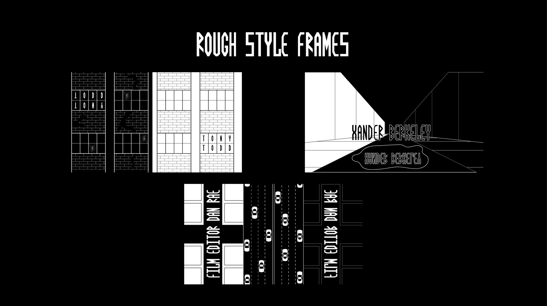
In my initial pitch, I created 3 distinct design concepts based on 3 major styles of title design: static, animated graphics, and composited titles. Each concept employed a different visual style that complimented different themes and events of the movie.
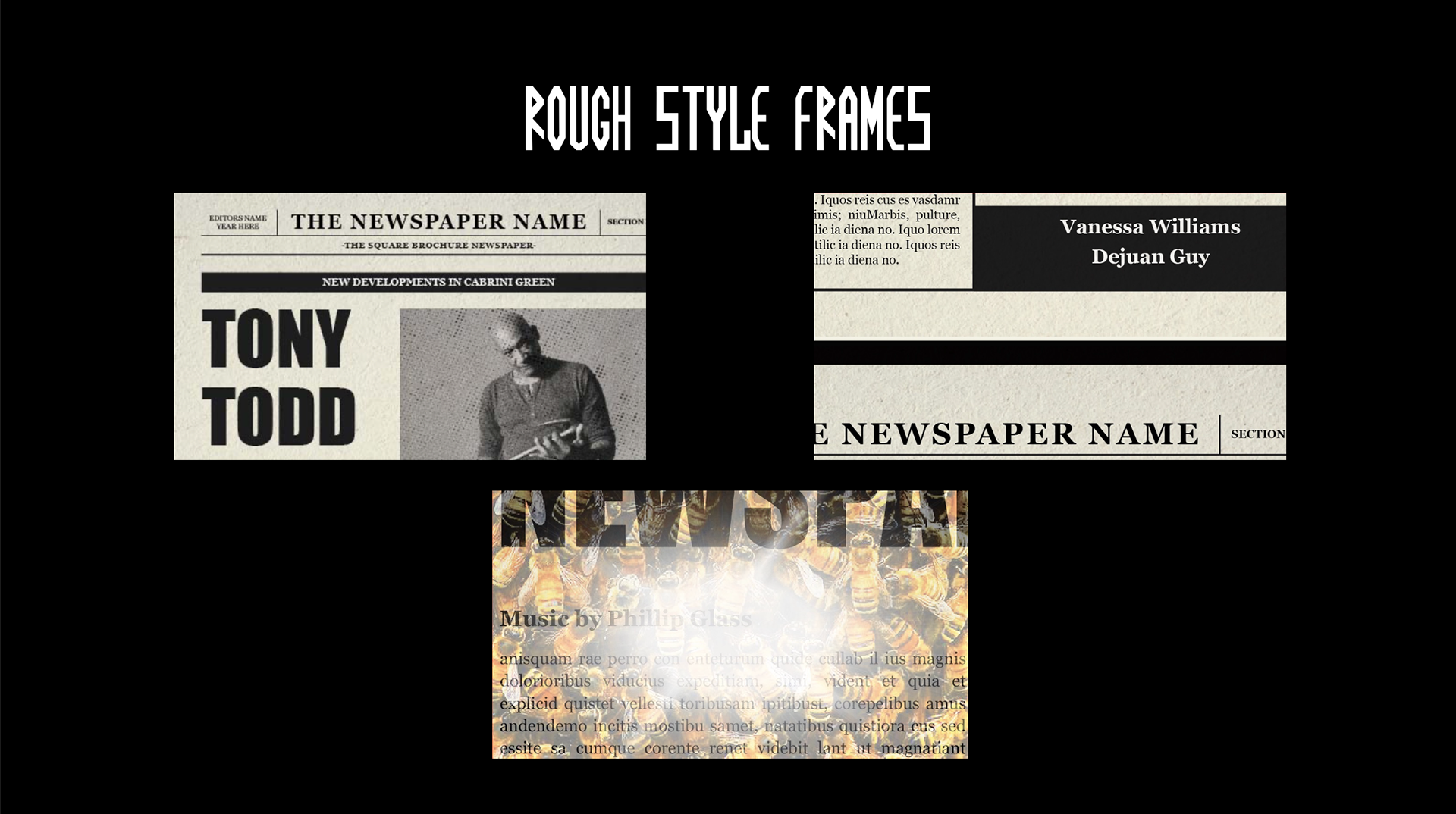
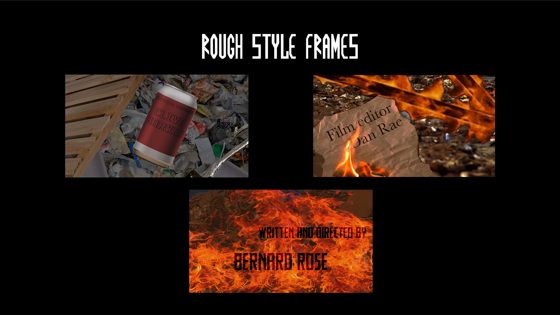
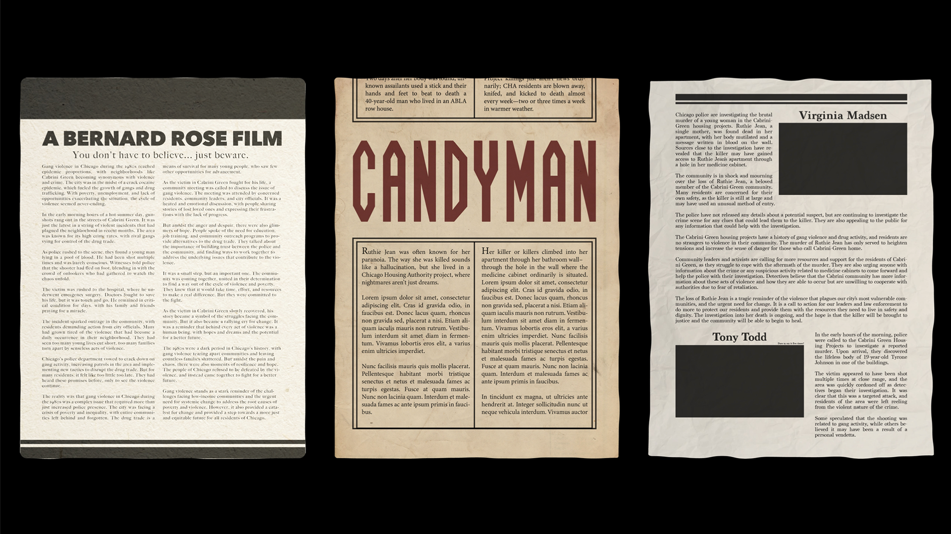
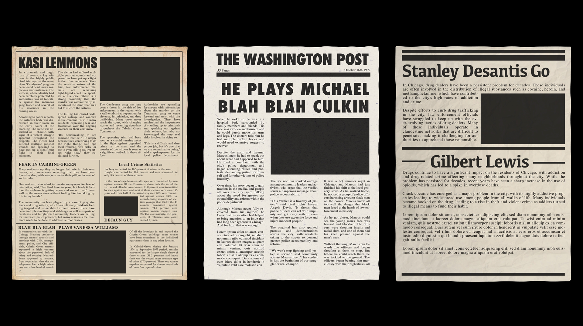
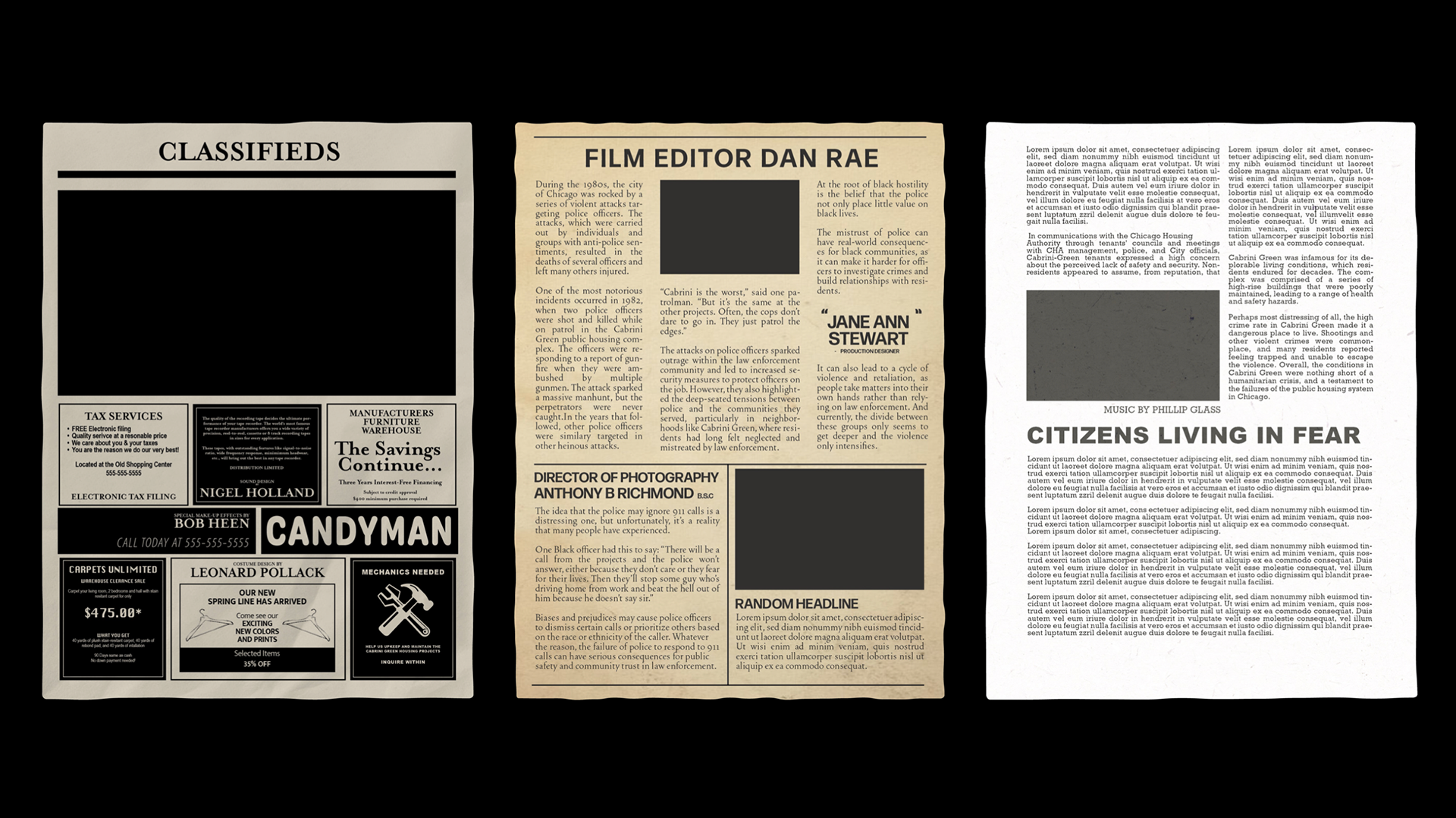
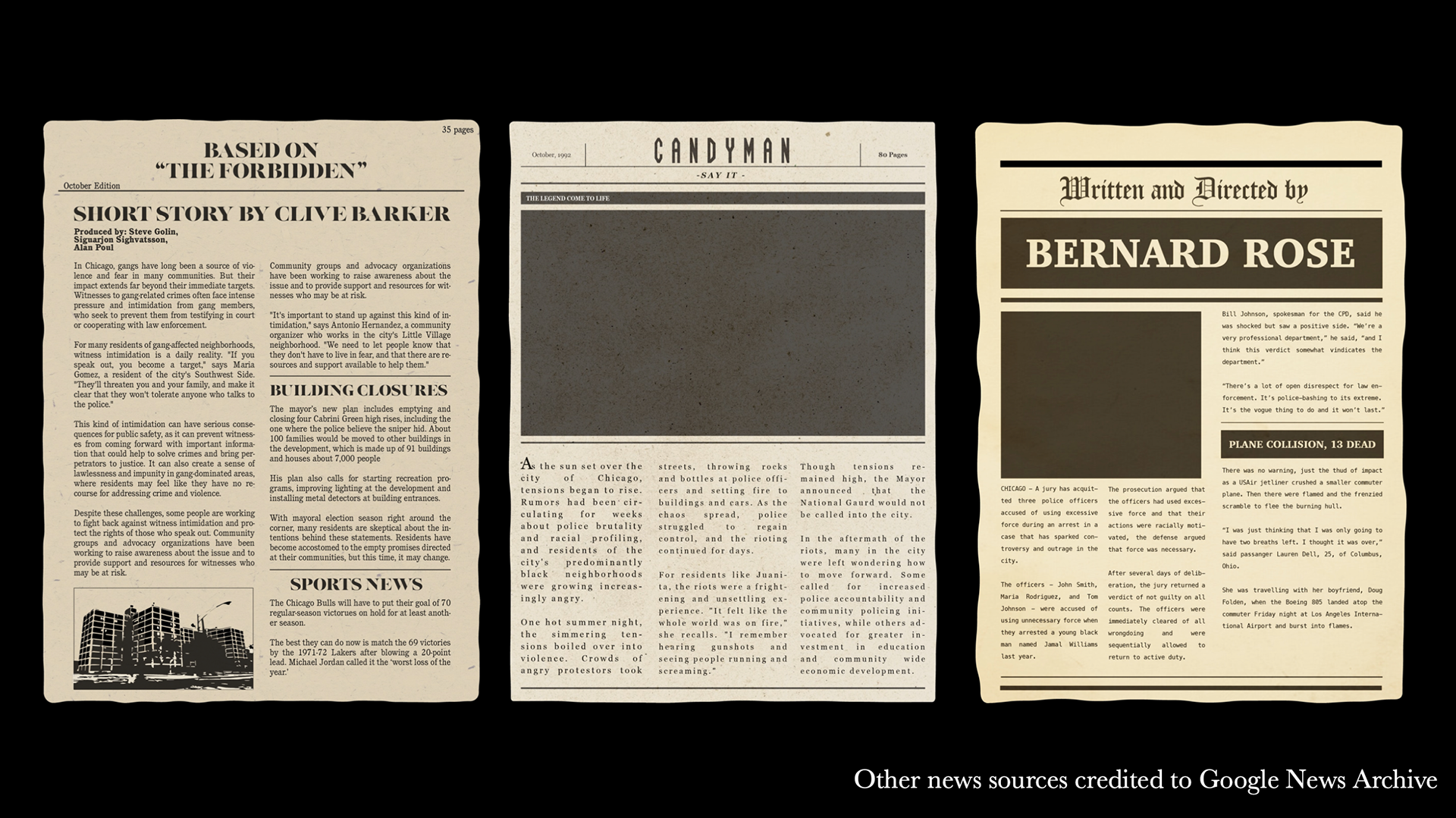
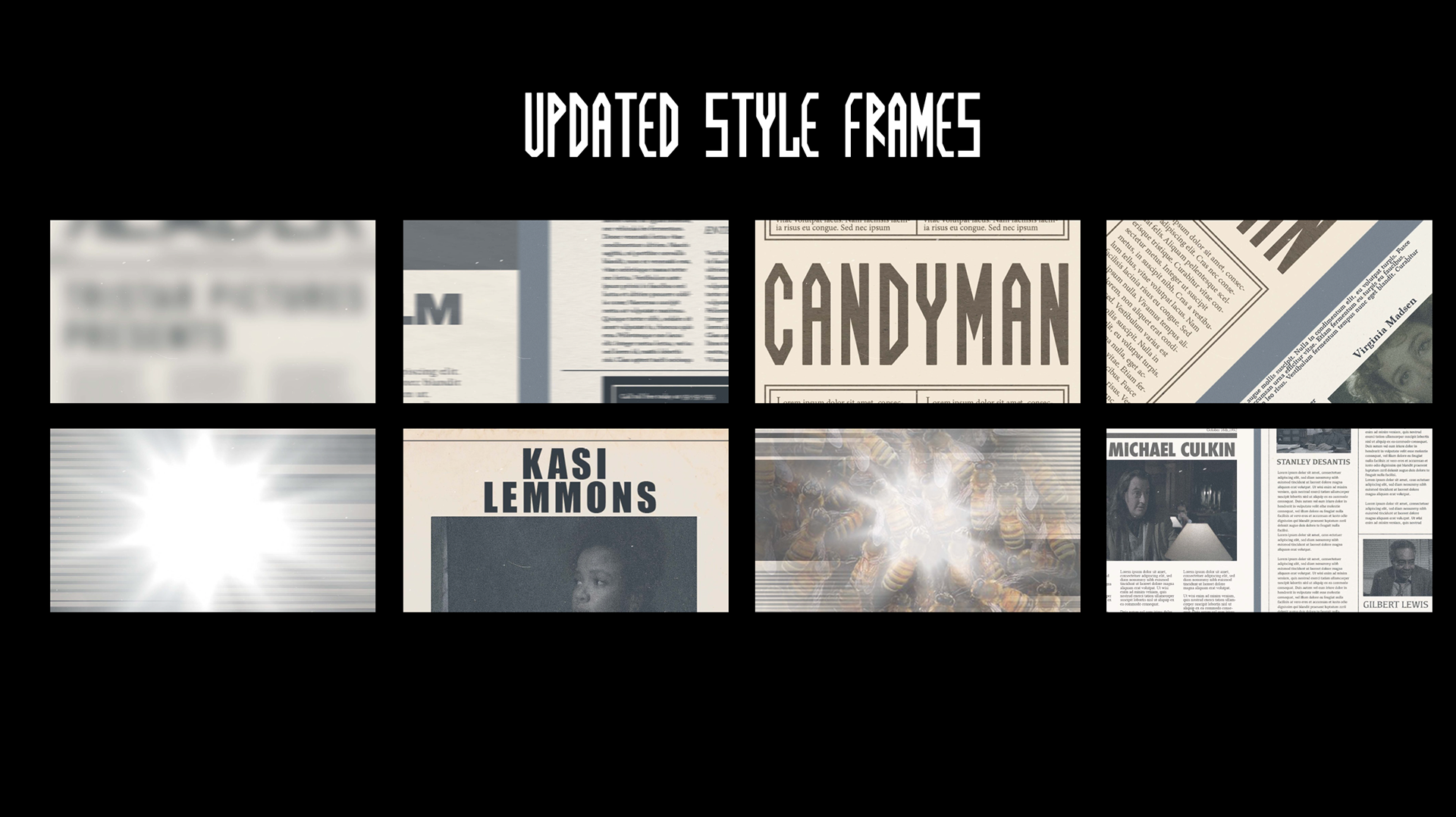
After pitching my ideas and getting some feedback, I decided to pursue option number 1, the static design concept. This concept utilizes newspapers as seen through microfilm readers to create both the credits and main movement. These news stories are reflective of the main character's journey and the thematic importance of legends in the film.
Visual Development
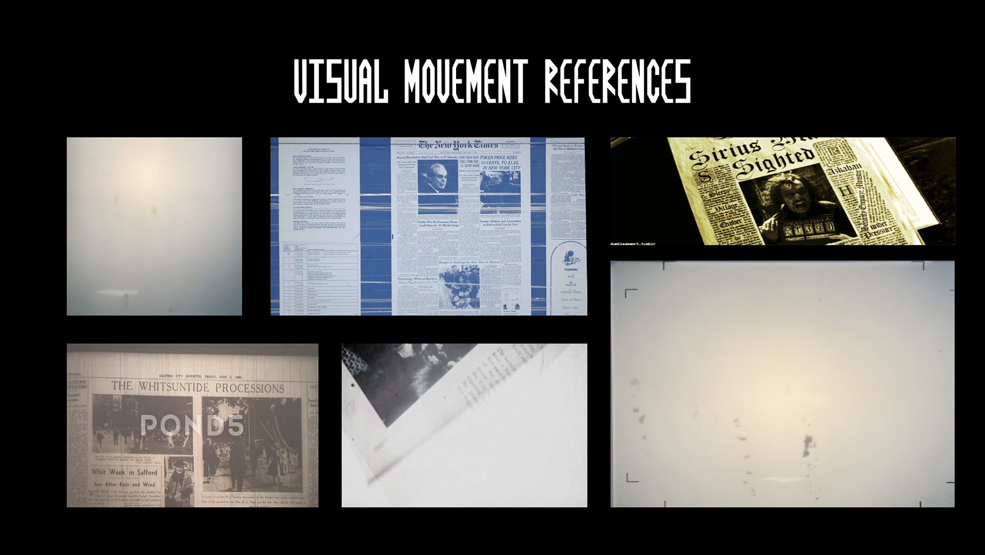
The visual design is driven through type, specifically through newspapers and the way they move through microfilm readers. So I started my design by researching 90's newspapers, photojournalism, and even found a microfilm reader on campus to play with!
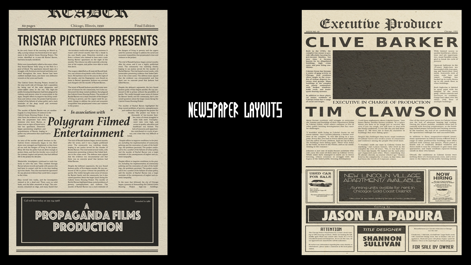
After my research, it was time for asset creation. I based my layouts on a few different factors, visual ones like the traditional layout, typography, color, and texture of newspapers, but also title sequence logistics like title/credit size ratios, sequence, and timings. I created these layouts using Adobe Illustrator, filled the text using ChatGPT, and found additional articles on Google Archive for transition fillers.
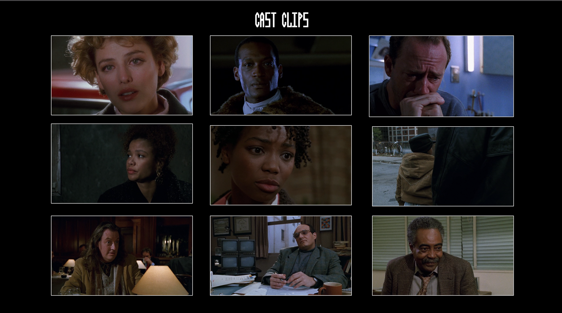
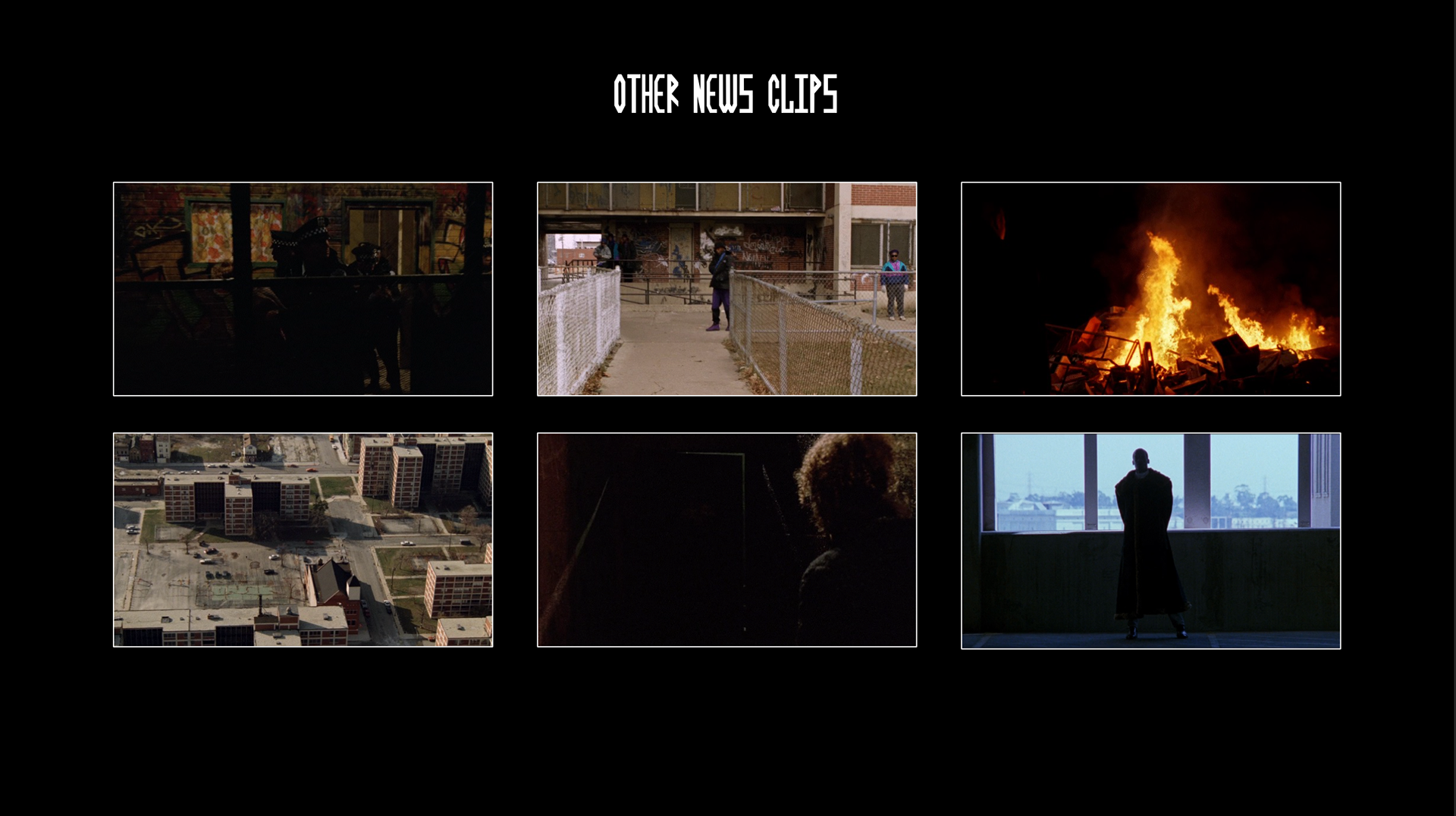
I then sourced clips from the movie to fill my newspapers and use as the flashing imagery.
When I finally had all my assets, textures, and effects, I used the original score and edited it all together in Adobe After Effects for a final product!
Animatic


